When the original Umpf branding was created, it reflected who we were at that moment. Over the last decade or so, the business has evolved massively. We’ve grown our team, expanded the services we offer, and built stronger relationships with everyone we work with.
Because of that, it felt like the right time to refresh our brand identity. This wasn’t about changing for the sake of it. Umpf has built recognition over the years, so the goal was to evolve our brand while maintaining a connection to its roots. The aim was to create something that still felt bold but more flexible, and more reflective of who we are now, while still keeping a connection to where we’ve come from.
How the circles became the brand identity
The previous logo design included lightbulbs, which we replaced with simpler circles. These circles became the foundation for the new brand identity. Zoomed out, they represent a network of employees, clients, and creative partners, a visual reflection of the collaborative culture behind our creative agency.
The move to an Employee Ownership Trust further reinforced the importance of people in shaping our brand. The new identity now mirrors this ethos, connecting our visual branding to the business structure and collaborative approach that makes our creativity successful.

We also wanted the brand to feel less rigid and uniform. What we do isn’t repetitive. No two days are the same. One minute we’re working on a PR campaign launch, the next it’s engaging social content, website design, a stunt, or influencer collaborations. The way we work has to stay fluid because that’s where the best ideas come from.
Rather than creating a design system that felt too neat or overly structured, we built something with a bit more movement and flexibility to it. The circles can be arranged, layered, and used in different ways across the brand design, which means the identity can adapt depending on the message, creative campaign, or platform.
Creating a flexible brand colour system
When it came to brand colour, there isn’t some deep strategic meaning behind every shade. We wanted a palette that felt warm, approachable, and energetic. More importantly, we wanted something that gave us the opportunity to create standout visuals across our website design, social media creative, and any designed campaign assets.
The colours were chosen to work together rather than compete with each other. Some combinations are bolder, some are softer, but together they give us a much bigger creative playground to work with, providing a visually striking and cohesive look for the agency.
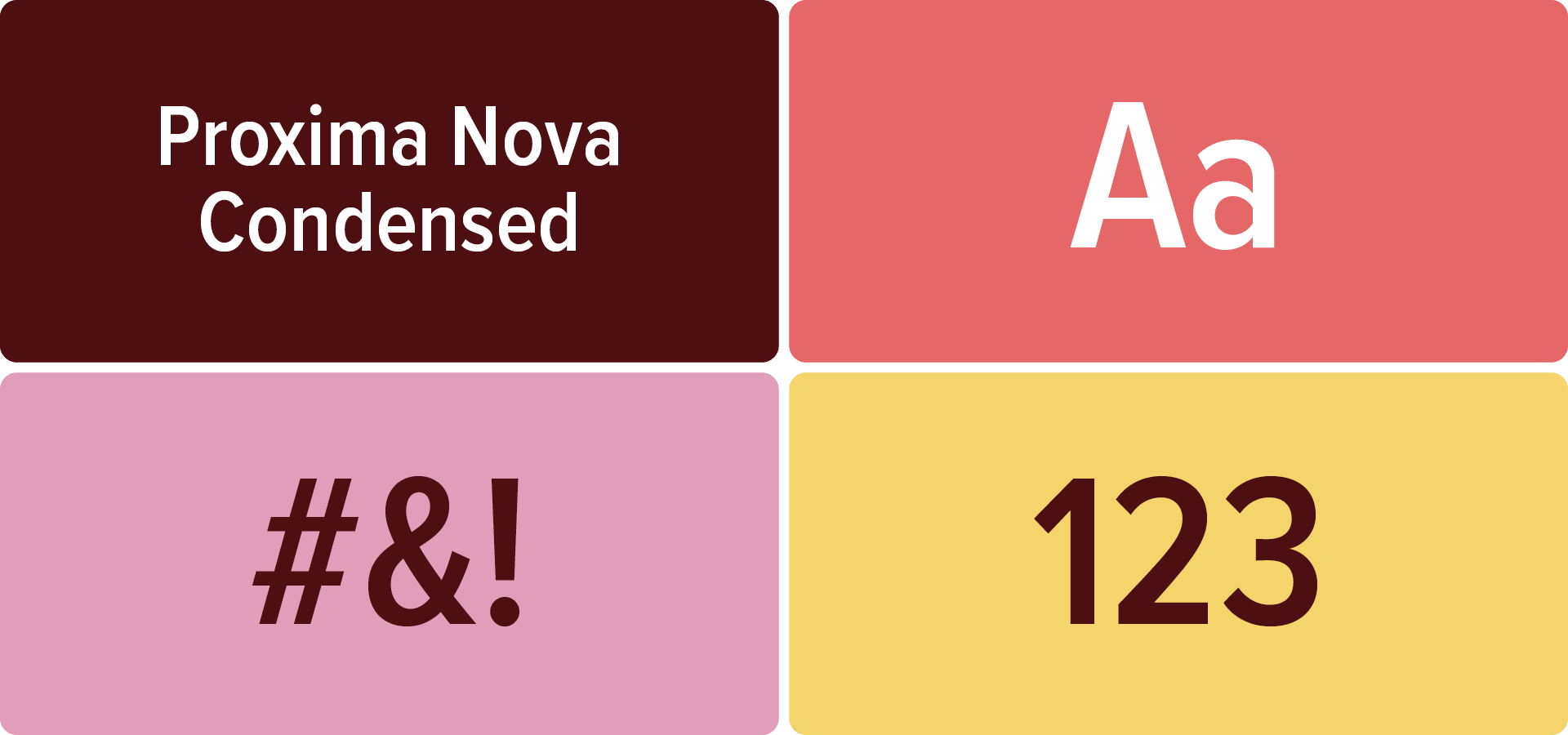
A brand typeface that feels familiar but refreshed
Typography evolved from Proxima Nova to Proxima Nova Condensed. This change modernises the look while maintaining consistency with our past brand identity. The new typeface works across presentations, website design, social media content, and marketing materials, supporting a strong hierarchy and flexibility in design outputs.
We’re now in the process of rolling the refreshed identity out across the whole business. Alongside that, we’re also creating clear brand guidelines so the team can confidently build their own assets while keeping everything consistent.
For us, this rebrand isn’t about looking different for the sake of it. It’s about making sure the brand reflects the business Umpf has become – collaborative, creative, connected, and built around people. A fresh look for the next chapter, while still staying true to where it all started.
Ready to make some noise?
If you’re looking to take your brand, campaign, or creative to the next level, get in touch with the Umpf team.